
Shopping bag colors aren't chosen randomly — they're strategic design decisions that shape how a brand gets read at a glance. At VSL Packaging, we work through color choices as part of the design process behind expertly designed custom shopping bags, whether the bag in question is a boutique paper bag, a set of grocery bags, or printed plastic bags for a retail chain.
Color is one of the first things a customer registers about a bag, often before they consciously read a logo or a message. Understanding the general associations different colors carry — and how those associations shift depending on material, industry, and audience — helps make color a deliberate choice rather than an afterthought in custom packaging projects.
Understanding Consumer Color Psychology: The Basics
Color psychology is a well-established area of marketing and design thinking: people form fast, largely subconscious impressions of a product or brand based on color before they process anything else about it. The exact size of that effect is debated and varies by study, audience, and context — treat any specific number you see cited on this topic with some skepticism — but the underlying pattern holds up across a lot of design research: color reads first, and it reads fast.
What matters more for a business choosing a bag color is the general association a given color tends to carry, and how well that matches the brand and the product going into the bag.
Warm vs. Cool: The Basic Split
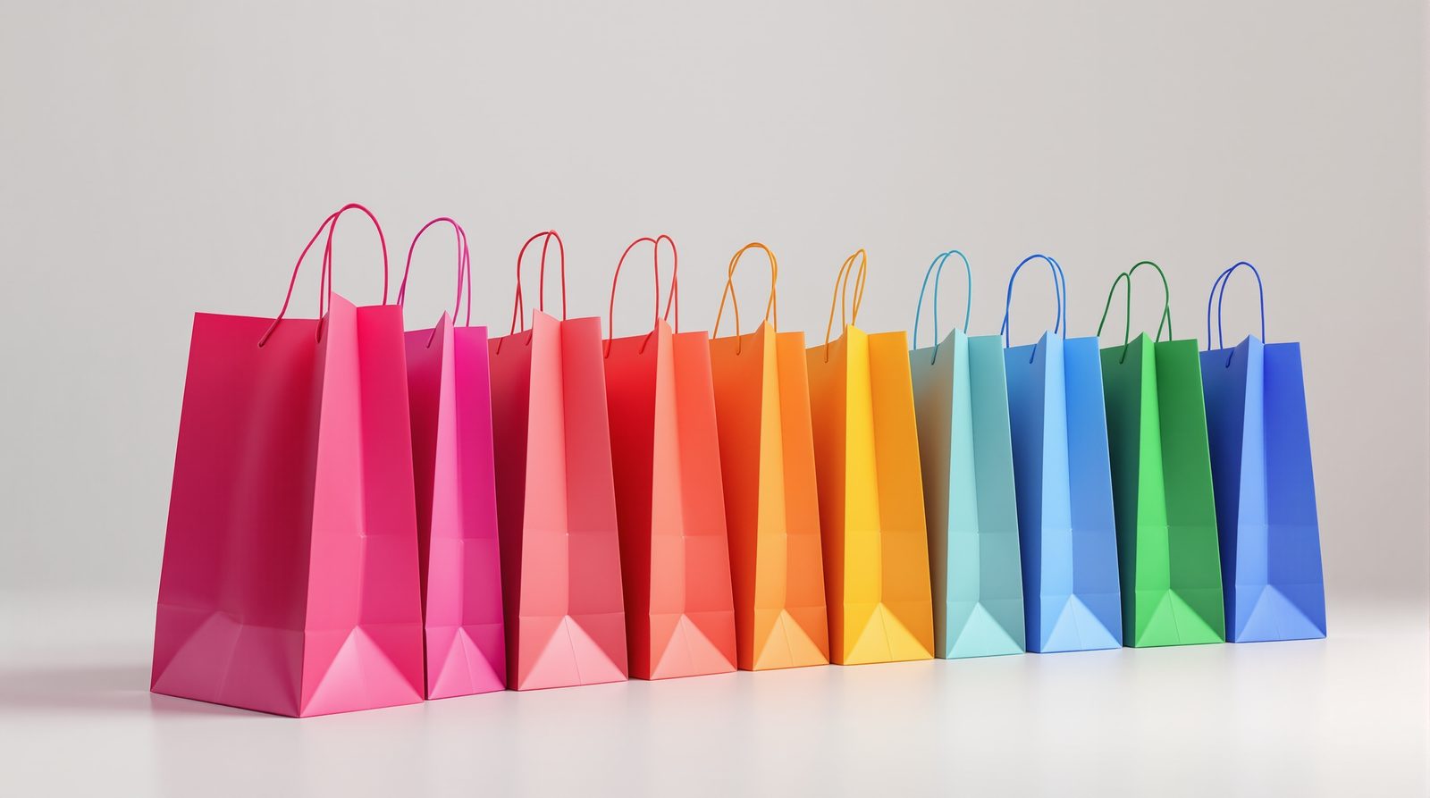
Warm colors — red, orange, yellow — tend to read as energetic and appetite-driving, which is a large part of why they show up so often in food and fast-casual branding. Cool colors — blue, green, purple — tend to read as calmer and more trustworthy, which is why they're common in health, wellness, and financial services branding. Neither read is universal, but it's a reasonable starting point for narrowing down options.
Warm Colors: Energy and Appetite
Red: Attention and Urgency
Red is one of the most attention-grabbing colors on a crowded street or a shop shelf, which makes it a common sign of urgency or a limited-time offer. It's a natural fit for food establishments and promotions where the goal is to catch a shopper's eye quickly rather than hold their attention over the long term.
Orange: Approachable Energy
Orange combines red's energy with a friendlier, more approachable tone, which suits casual food markets, family-oriented businesses, and brands that want to read as fun rather than formal.
Yellow: Value and Optimism
Yellow tends to signal affordability and friendliness, which is part of why it shows up often in discount retail and casual café branding — it reads as welcoming rather than exclusive.
Pricing a bag run?
Get structure, stock, and finish quoted from your real quantities.
Cool Colors: Trust and Calm
Blue: Credibility
Blue is widely considered the most consistently trusted color across color-psychology research, which is why it shows up so often in financial services, healthcare, and professional branding. Different shades send different signals: navy tends to read as authoritative, a brighter royal blue suggests something more premium, and a lighter blue reads as calm and approachable.
Green: Health and Sustainability
Green carries strong associations with health, nature, and sustainability, which makes it a common choice for organic grocery stores and eco-conscious fashion brands. A deeper forest green tends to read as more traditional or premium; a brighter green reads as fresher and more modern.
Purple: Luxury and Creativity
Purple has long carried associations with luxury and creativity, which is why it shows up often in high-end retail and creative-industry branding, where the goal is to signal something a bit more exclusive or artistic than a standard retail palette.
Beige and Neutral Tones
Not every brand wants a bold color statement. A light beige or other neutral tone reads as understated and premium in its own way — common in fashion and beauty packaging where the goal is to let the product, not the bag, carry the visual weight.
Strategic Color Combinations
A single color works fine on its own, but combining two colors deliberately can carry more of a brand's personality than either color alone. High-contrast combinations — black and white, for example — read clearly across a wide range of lighting conditions, from a bright storefront to a dim transit platform, which matters for a bag that needs to stay legible wherever it ends up. Colors that sit near each other on the color wheel, like blue and green, tend to read as harmonious rather than jarring, which suits health and wellness brands in particular.
Color by Industry
Food and Beverage
Warm colors and earth tones both show up often in food branding, for different reasons: warm colors read as appetite-driving, while earth tones read as natural or organic. Which one fits depends on whether the brand is chasing urgency or authenticity.
Fashion and Retail
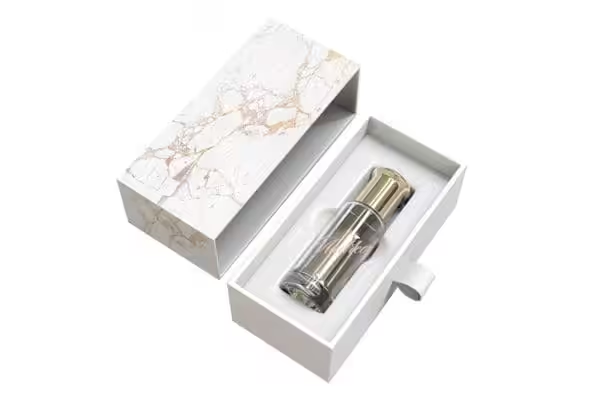
Fashion retailers often reach for a neutral bag — black is a common choice — specifically so the color doesn't compete with the merchandise inside. Metallic accents on an otherwise plain bag can suggest a bit of luxury without overwhelming a smaller item. It's a natural fit alongside luxury boxes.
Health and Wellness
Calming blues and greens tend to reduce the visual noise around a purchase, which is part of why they're common for medical practices and wellness brands — the color itself is doing some of the work of signaling cleanliness and care before a customer reads a single word on the bag.
Bag Type and Material Affect Color
Color doesn't read the same way on every material. A woven fabric tote holds ink differently than a smooth paper bag or a glossy plastic film, so a color that looks rich on one material can look flat on another — worth checking with a physical proof rather than a screen mockup alone.
Grocery bags are a good example of how bag type changes the color conversation. Grocery bags tend to be larger and carried longer distances than a boutique shopping bag, so simple two-color designs in earth tones generally stay easier to read on that bigger surface than a busy, multi-color pattern would. Reinforced handles on grocery bags also carry weight in the design: a contrasting handle color makes a logo easier to spot at a glance across a shop floor, and it's a simple way to work in a second color without a full two-color print run. Plastic bags, especially glossy ones, tend to make colors read brighter and more saturated than the same color on matte grocery bags or paper.
Cultural Considerations
Color associations aren't universal — they shift across cultures, and a diverse customer base means those differences are worth acknowledging rather than assuming one reading applies to everyone. Red, for example, carries different associations in different cultural contexts than it does in mainstream American retail. If your customer base spans several cultural contexts, a quick check on how a chosen color reads across that specific audience is cheap insurance before committing to a large print run.
Seasonal Color Strategies
Color choices don't have to stay fixed year-round. Fresh greens and blues tend to suit spring, brighter oranges and yellows suit summer, warm reds and golds suit autumn, and deeper blues and blacks suit winter. A seasonal rotation is a reasonable way to keep a brand feeling current without redesigning the whole bag — often just a color and light design change on the same structure.
Sustainable Color Options
Recyclable materials and water-based inks are available for brands weighing sustainability alongside visual impact, without necessarily giving up color vibrancy. It's worth raising sustainability priorities early in the material and color conversation, since some inks and coatings behave differently on recycled versus virgin stock.
Choosing Colors With Confidence
Choosing a shopping bag color comes down to a few practical questions: What does this color generally signal, and does that match the brand? How will it read on the actual material — paper, plastic, or woven fabric — and hold up under real store lighting rather than a screen? And does it stay legible for as long as a customer is likely to carry and reuse the bag? A physical prototype answers those questions better than a swatch or a screen mockup, which is why every VSL Packaging order moves from design to a 3D rendering to a physical prototype before a color choice gets locked into a full production run.
Ready to work through color options for your next shopping bag order? Request a quote and tell us the product, the industry, and the look you're going for, or call VSL Packaging at (646) 843-0800 to talk through options with our design team.
Related Shopping Bag Articles
More packaging resources: How Does Branding Influence the Packing of a Product? · How To Get A Food Product Packaged?